ShopDreamUp AI ArtDreamUp
Deviation Actions

2. All-Around SUPERWOMAN and HER STORY
ALL OF 1ST TIERS BENEFITS, COMBINED WITH ALL OF THE CONTENT FROM MY PREMIUM GALLERIES ABOUT WOMAN OF STEEL. INCLUDING AT LEAST ONE STORY ABOUT SUPERWOMAN EVERY MONTH.
$8/month


Suggested Deviants


Suggested Collections


You Might Like…


Description
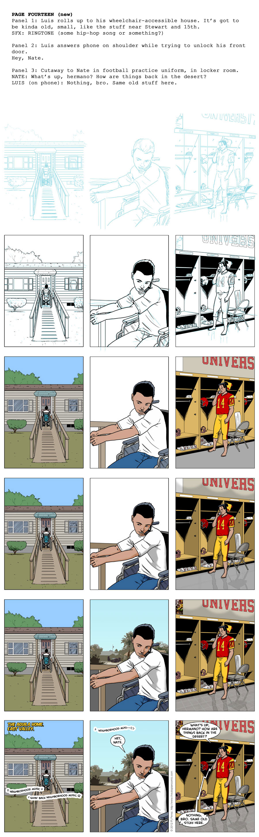
For process junkies only: How I make THE UTOPIAN: FOUNDATION, my twice-weekly "illustrated soap opera" webcomic. I'm a process nerd, so I figure some of you out there are too.
1. Script: Because I do ALL the production, start to finish, on THE UTOPIAN, there's really no need for me to write a full script. But I do, mainly because it forced my brain to separate out the pieces of the process. But there are still usually vague notes to myself, such as the "only I'd get it" reference to the house design.
2. Digital pencils: Sometimes there will be a thumbnail sketch before I get to the full "pencils," but for this strip, there wasn't. I gather my reference materials in various layers of Photoshop (house, locker room, etc.), and "pencil" using a standard feathered brush and a color approximating non-repro blue. I've actually started using a light red color instead, because when I print the layouts onto art board to ink manually, it's easier to isolate and remove the red after scanning than it is the blue.
3. Digital inks: I go back and forth. Lately I've been doing a lot more "traditional" inking (though with pens and pen-brushes, not quills and nibs), mainly because it's faster and I can do it anywhere. This strip was done digitally, which lets me get more precise/cleaner, but sometimes it feels TOO clean. The "UNIVERSITY" letters I made by typing them with the text tool, simplifying the layer, distorting for perspective, and then deleting all but the stroke.
4. Flat colors: Pretty mindless - Just "filling in" the lines with basic colors. I have a palette with the main characters' tones for skin, hair, eyes, etc., and other recurring items like Nate's football uniform. The other stuff I try to keep as natural as possible, unless I'm going for emotional effect.
5. Shading: I usually only do one or two levels of accents when coloring THE UTOPIAN, because a) it's faster and b) I like the clean, cel-shading look. Sometimes I'll do a layer of shade AND a layer of highlights, sometimes (as with this strip), just shading. This adds depth, shadows, shape, etc. I generally shade in black, and either reduce the layer's opacity to 30 or 40%, or change it to "overlay," which I did for the outdoor shading on this strip.
6. Odds and ends: The background in panel 2 was basically a screen capture of a Google Maps street view from a neighborhood here in Vegas, filtered with the "Cutout" effect (with alterations). The poster in the locker room is some sort of USC Trojans promotional image blurred out, and I felt like the floor needed texture, so I laid down a distorted tile pattern on an overlay layer.
7. Lettering: On my print comics, I letter in Illustrator, which is the industry standard. But I still enjoy doing THE UTOPIAN all in Photoshop. I guess I just got used to it and I sort-of enjoy the challenge of creating lettering and balloon effects manually. I use a lot of Blambot's free fonts, mainly Creative Block for the dialog text, as I did with the original UTOPIAN series. A lot of others found it afterwards and use it too, but again, I like the consistency.
And that's basically it. Hope you learned something, and if you have any questions, let me know below!
(Oh, and please read THE UTOPIAN: FOUNDATION: [link])
Image size
900x2908px 582.88 KB
Comments0
Join the community to add your comment. Already a deviant? Log In